





Create Interactive Safety Dashboard Using Excel

Unlock the Power of Excel & Data Analysis Today! 💡 Dive into the World of Pivot Tables & Charts 📊
4.79
  • 2,384 learners
  • 4

    Sections

    11

    Lessons

    1

    File

    Access

    Lifetime

    Current Status

    Not Enrolled

    Price

    Closed

    Get Started

    This course is currently closed

    Create Interactive Dashboard Using Excel

    About the course

    Course contents

    Features

    Message from Instructor

    Reviews

    FAQ


    ...

    Pay securely with major cards
    Apple Pay Google Pay Visa MasterCard Mada Tabby Tamara

    About the Course

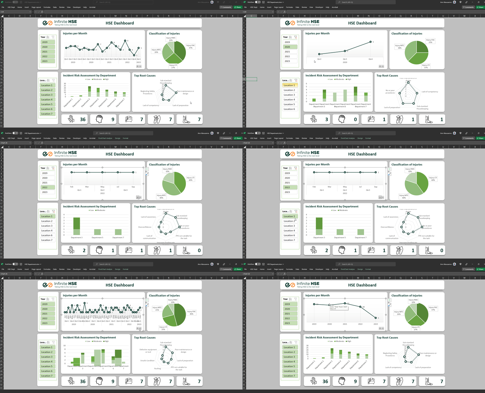
    Turn your data into interactive dashboards — for the price of a lunch meal 🥘

    Dashboards and charts are essential tools for summarizing and effectively communicating your messages and results.

    No need for complicated software—Microsoft Excel’s pivot tables and pivot charts provide everything you need to build interactive dashboards.

    In thiscourse, you’ll learn how to create a stunning interactive dashboard from scratch, step by step! Plus, you can showcase your skills by applying what you’ve learned and earning a certificate upon creating your own dashboard.

    Course Contents

    What You Will Learn
    Introduction

    Gain an overview of the course and understand how dashboards can simplify data communication.

    Why Data Analysis Skills Are Important

    Explore the value of data analysis in making informed decisions and boosting your career.

    Pivot Tables

    Learn the fundamentals of pivot tables and how to organize data for creating dashboards.

    Creating Your Dashboard

    Step-by-step guidance on designing, building, and customizing your interactive dashboard.

    Enhancing Your Dashboard

    Add finishing touches like icons and layouts to make your dashboard professional and engaging.

    Full course contents

    Course Content

    How You Heard About Interactive Dashboard Course
    Introduction to Interactive Dashboard Course
    Why Data Analysis Skills is Important for YOU
    Part 1 – Pivot Tables
    1.1 – Introduction to Pivot Tables and Analysis Data Using Them
    1.2 – Create Tables That Will be Used in Our Dashboard
    Part 2 – Create Dashboard
    2.1 – Draw a Sketch for Your Dashboard
    2.2 – Insert Pivot Charts
    2.3 – Design Layout for Dashboard
    2.4 – Move Charts to Dashboard
    2.5 – Use Icons
    The End
    Opportunity for Improvement
    Interactive Dashboard Course Evaluation
    How to Get Certificate for This Course

    Course Features

    Why Choose This Course

    Lifetime

    Enjoy lifetime access to high-quality, expert-led training on safety data storytelling.

    Access Anytime

    This pre-recorded course allows you to learn at your convenience, whenever and wherever works best for you.

    No Prior Experience

    No previous experience in data analysis is needed—this course is designed for beginners and professionals alike.

    Practical and Hands-On

    Learn by doing! This course takes you step by step through creating a professional interactive dashboard from scratch.

    No Advanced Software Needed

    Master powerful tools like pivot tables and charts using Microsoft Excel—no need for expensive or complicated software.

    Earn a Certificate

    Prove your expertise by creating your own dashboard and earning a certificate to showcase your accomplishment.

    Instructor

    Note From Instructor  1✉️
    Amr Abousamra
    Data Analysis Professional

    “Data has the power to drive decisions, but only if presented effectively. With 16  years of experience in safety, data analysis and data visualization, I’ve seen how a well-crafted dashboard can simplify complexity and inspire action. This course combines practical tools like pivot tables and charts with proven techniques to create interactive dashboards. My goal is to help you master these skills and confidently turn your data into a story that speaks for itself.”

    Reviews

    Listen to Our Learners
    Altayeb Mohammed
    Altayeb Mohammed
    Safety Data Visualization Using Excel

    تجربة تعليمية متكاملة: الاستثمار الأمثل في النجاح المهني

    كورساتكم هي الخيار المثالي. المحتوى مُصمّم بشكل شامل، وده جذبني جداً. كل حاجة واضحة ومبسّطة، وبتساعدني أفهم الموضوعات بطريقة أعمق.

    المدرب فعلاً ممتاز جداً، عنده خبرات كبيرة ومش بس بيشرح، كمان بشجعك على التطبيق العملي. الطريقة اللي بيقدم بيها المعلومات بتخلي الدروس أكثر تفاعلية وفعالية، وده الشي اللي كان ناقصني.

    ختاماً، أقول إنو الاشتراك في كورساتكم هو استثمار في نفسي، وأنا متأكد إنه حيساعدني أحقق أهدافي المهنية ويزودني بالمعرفة اللازمة للنجاح وتحقيق تقدم كبير في مجالي.

    الكورس لم يكن مجرد تعليم، بل كان تجربة شاملة ساعدتني في تجاوز التحديات وتحقيق تقدم كبير في مجالي.

    Ahmed Khairalla
    Ahmed Khairalla
    Safety Data Visualization Using Excel

    تجربة استثنائية في تعلم تحليل البيانات

    أنا أخذت كورسات كثيرة الحمد لله، لكن شهادة لله ما حصل وقابلت شرح مفصل مثل هذا الكورس (عملي ونظري كمان). الكورس مهم جدًا وحقيقة لم أكن أعرف كيف أعمل تحليل بيانات أو داشبورد، لكن بعد أن أخذت هذا الكورس أستطيع فعلاً تطبيقه في مكان عملي.

    أنا سعيد جدًا بمعرفة هذه المنصة، بالرغم من معرفتي بها منذ زمن قصير إلا أنها كانت سببًا رئيسيًا في تطوير مهاراتي. أنا حريص جدًا على أخذ كل الكورسات التي ستقدم عبركم.

    وفقكم الله وإيانا في خدمة العلم.

    Mohamed Eltabakh
    Mohamed Eltabakh
    Safety Data Visualization Using Excel

    One of the Best Data Analysis Courses for the HSE Field

    This course is one of the best and most insightful data analysis courses in this subject, particularly in the HSE field. I learned a lot from this course, including how to create a large interactive dashboard within the safety system, such as work permits, injury and accident statistics, insecure conditions, and how to display data in excellent and professional visuals.

    Reda Sokar
    Reda Sokar
    Safety Data Visualization Using Excel

    Exceptional Presentation and Valuable Insights

    The presenter was truly exceptional, and the trainer's strong safety background significantly contributed to their effective information delivery. Ultimately, despite being a free course, its quality exceeded all expectations.

    FAQ

    Your Questions Answered!
    Do I need prior experience to benefit from this course?

    No, this course is designed for beginners and is perfect for anyone looking to enhance their ability to communicate data clearly, regardless of prior experience.

    How long will it take to complete the course?

    The course takes less than one hour to complete in total, but you’ll receive a new lesson every day to help you learn and apply the concepts at a steady pace.

    Will I get a certificate after completing the course?

    Yes, you’ll receive a certificate, but you’ll need to share the dashboard you create as part of the practical assignments.

    Which version of Excel do I need to take this course?

    This course is compatible with Excel 2016 and later versions. If you’re using Excel Online or Excel 365, you’ll also have access to all the features needed for this course.

    Do I need any additional software to complete the course?

    No, all the tools and features required to create your dashboard are available within Microsoft Excel, so no additional software is needed.

    Scroll to Top